AT&T has settled with the Federal Trade Commission (FTC) and agreed to pay out $60 million to current and past customers that may have been affected by misleading claims about unlimited data. The settlement is in response to the FTC’s 2014 accustation that AT&T failed to adequately disclose that customers on unlimited data plans could have their speeds throttled substantially. Here are a few bits from the 2014 FTC complaint:
The FTC’s complaint alleges that the company failed to adequately disclose to its customers on unlimited data plans that, if they reach a certain amount of data use in a given billing cycle, AT&T reduces – or “throttles” – their data speeds to the point that many common mobile phone applications – like web browsing, GPS navigation and watching streaming video – become difficult or nearly impossible to use…AT&T’s marketing materials emphasized the ‘unlimited’ amount of data that would be available to consumers who signed up for its unlimited plans…AT&T, despite its unequivocal promises of unlimited data, began throttling data speeds in 2011 for its unlimited data plan customers after they used as little as 2 gigabytes of data in a billing period. According to the complaint, the throttling program has been severe, often resulting in speed reductions of 80 to 90 percent for affected users. Thus far, according to the FTC, AT&T has throttled at least 3.5 million unique customers a total of more than 25 million times…consumers in AT&T focus groups strongly objected to the idea of a throttling program and felt ‘unlimited should mean unlimited.’
Here’s an excerpt from the FTC’s press release from today (emphasis mine):
As part of the settlement, AT&T is prohibited from making any representation about the speed or amount of its mobile data, including that it is “unlimited,” without disclosing any material restrictions on the speed or amount of data. The disclosures need to be prominent, not buried in fine print or hidden behind hyperlinks. For example, if an AT&T website advertises a data plan as unlimited, but AT&T may slow speeds after consumers reach a certain data cap, AT&T must prominently and clearly disclose those restrictions.
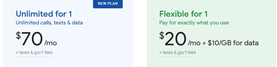
I’m glad to see the FTC cracking down on misleading practices. Bogus “unlimited” plans seem to be much more common today than they were in 2014.