Earlier this year, I quietly released an interactive coverage map that shows the strength of cell signals from the three nationwide networks (Verizon, AT&T, and T-Mobile). I’ve now polished the map to a point where I’m ready to make an official announcement.
If you want to cut to the chase, try the coverage map now. The rest of this post details how the map works, its limitations, and improvements I’ll release going forward.
Map Structure
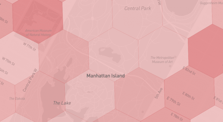
The information surfaced in Coverage Critic’s map is richer than what’s typically found on carriers’ own maps.
Here’s what the map looks like when representing T-Mobile’s coverage in Vail, Colorado:
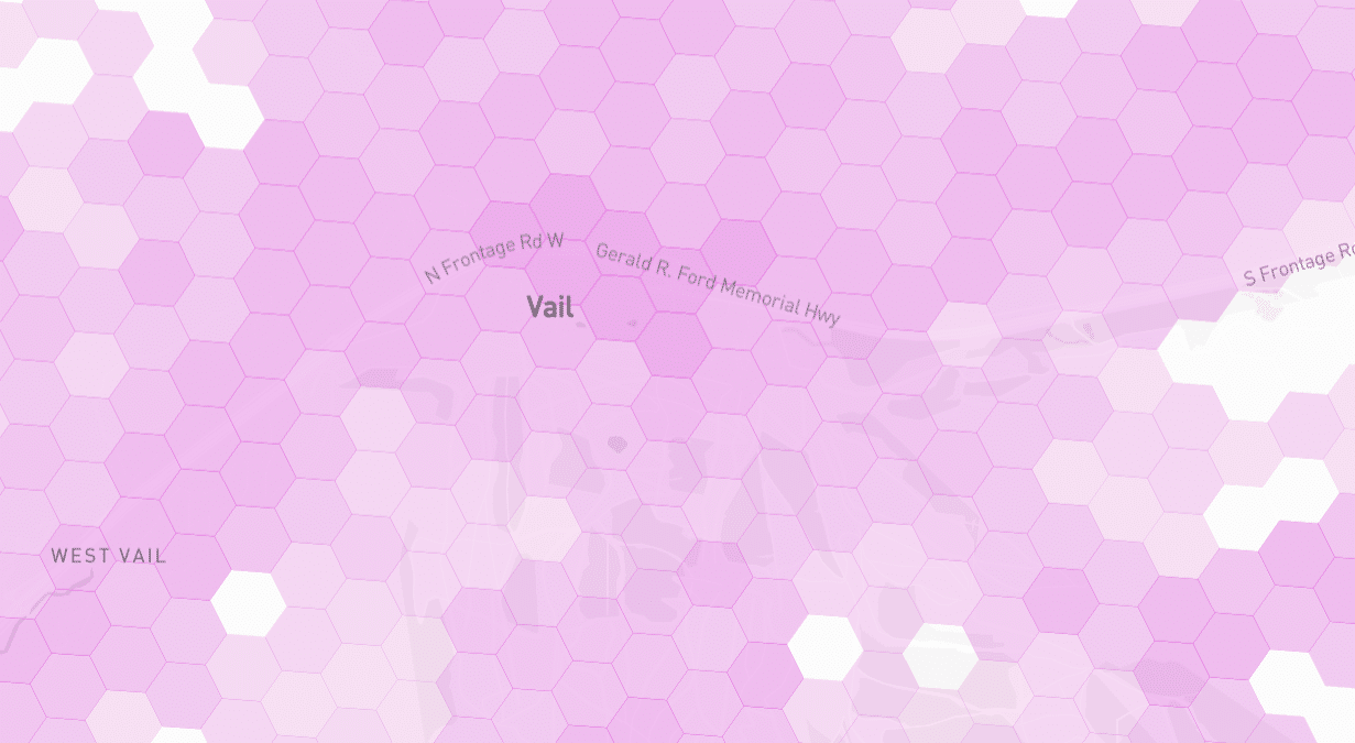
Each hexagon is the size of a few city blocks. Darkly shaded hexagons indicate where T-Mobile’s network is predicted to have a strong signal. Lighter shades indicate weaker signals. No coverage is expected in areas in white.
Compare Networks
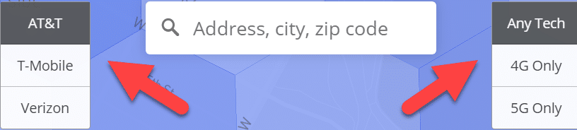
Map users can toggle between different networks and technologies with a single click.
After selecting a specific hexagon, users are presented with details about coverage within the hexagon:
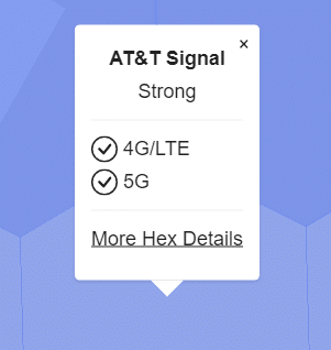
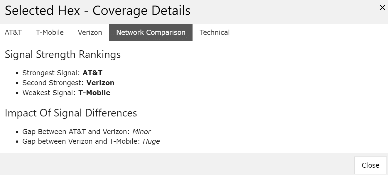
With a few more clicks, users can compare coverage within the hexagon across the major networks:
Zoom Levels
In rural and remote areas, the map can be informative from a zoomed-out perspective. However, in dense cities, the zoomed-out view becomes chaotic due to a plethora of cellular antennas and tall buildings that block signals.
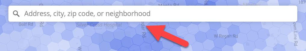
In big cities, I recommend initially entering an address or the name of a neighborhood. The map will automatically zoom to the selected spot at an appropriate zoom level.
Data Sources
The base data underlying the maps comes from the FCC’s Broadband Data Collection program. I adjust the data from the FCC based on the results of in-house testing.
For the moment, the adjustment procedure is relatively simple, but I have more ambitious plans in the works. In the future, I’ll share more about my in-house testing and my intention to incorporate data from third parties.
Limitations
The map shows predicted signal strengths rather than on-the-ground measurements of signal strength.
While signal strength is a decent proxy for service quality, it’s imperfect. As the map evolves, I’ll account for additional factors that affect performance.
Known Issues
The map has a few major issues:
- Coverage data is unavailable in Michigan and Alaska
- Verizon’s LTE coverage is not correctly represented in portions of the Northeastern United States
- Coverage information is sometimes missing around bodies of water and state borders
Upcoming Improvements
At the moment, the map draws on FCC data that reflects networks’ coverage as of mid-2022. A newer data set, reflecting coverage at the end of 2022, was released yesterday. As I build a new version of the map incorporating the latest data, I’ll also resolve some of the issues.
Additional networks, including US Cellular and Dish, will be included in an upcoming version of the map.
Acknowledgments
The map relies on the work of an awful lot of other people. I’d particularly like to thank the FCC’s Broadband Data Task Force, the folks that build and maintain the H3 geospatial indexing system, and contributors to OpenStreetMap.
I’d also like to thank my audience for helping me get this far. I’m enjoying the experience as Coverage Critic evolves into a more useful product.