AT&T’s Claim To Being America’s Best Network

AT&T has been running an ad campaign with commercials where the company claims to offer the best network.

These commercials start with a funny skit that leads to the line, “just ok is not ok.” The commercials’ narrator then says something along the lines of: “AT&T is America’s best wireless network according to America’s biggest test.”

Here’s an example:


Alternate versions of the commercial involve ok babysitters, ok sushi, ok surgeons, and more.

AT&T bases its “best network” claim on the results of Global Wireless Solutions’s (GWS) 2018 tests. The claim is at odds with the results of many other companies’ evaluations and my own view.

The meaning of the word “best” is ambiguous, but I’d guess that a survey of professionals in the wireless industry would find that most people consider RootMetrics to be the best evaluation firm in the wireless industry. Verizon fared far better than AT&T in RootMetrics’s most recent evaluation.

It’s unclear to me what AT&T is claiming when it calls GWS’s test, “America’s biggest test.” Is it the biggest test in terms of miles driven, data points collected, area covered, or something else? GWS may have the biggest test according to one metric, but it’s not unambiguously the biggest test in the nation.

GWS’s OneScore Methodology & 2019 Results

Global Wireless Solutions (GWS) evaluates wireless networks according to the company’s OneScore methodology. At the moment, AT&T cites GWS’s results in commercials where AT&T claims to offer the best network.

In an article about performance tests of wireless networks, GWS’s founder, Dr. Paul Carter, writes:1

With so many conflicting research reports and with every network touting itself as number one, it’s critical that wireless carriers are transparent about how and what they actually test. If what was tested doesn’t match up with the average consumer experience, then was that test truly worthwhile?

Unfortunately, GWS itself is not especially transparent about its methodology. The public-facing information about the company’s methodology is sparse, and I did not receive a response to my email requesting additional information.

As I understand it, GWS’s methodology has two components:

  • Technical performance testing in about 500 markets
  • Consumer surveying that helps determine how much weight to give different metrics

Technical testing

In 2019, GWS conducted extensive drive testing; GWS employees drove close to 1,000,000 miles as phones in their vehicles performed automated tests of networks’ performance.2

The drive testing took place in about 500 of the markets, including all of the largest metropolitan areas. GWS says the testing represents about 94% of the U.S. population.3 I expect that GWS’s focus on these markets limits the weight placed on rural and remote areas. Accordingly, GWS’s results may be biased against Verizon (Verizon tends to have better coverage than other networks in sparsely populated areas).

Consumer surveying

In 2019, GWS surveyed about 5,000 consumers to figure out how much they value different aspects of wireless performance.4 GWS finds that consumers place a lot of importance on phone call voice quality, despite the fact the people are using their phones for more and more activities unrelated to phone calls.5 GWS also finds that, as I’ve suggested, consumers care a lot more about the reliability of their wireless service than its raw speed.6

Combining components

As I understand it, GWS draws on the results of its surveying to decide how much weight to place of different aspects parts of the technical performance tests:

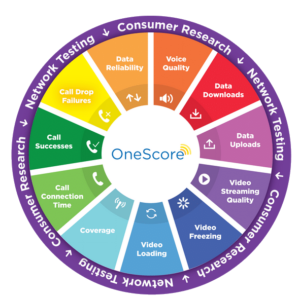
The consumer survey includes questions asking respondents to rank the importance of different tasks they perform on their mobile device, as well as the importance of different aspects of network performance. Our network test results are then weighted according to how consumers prioritize what’s important to them, and evaluated in eleven different network performance areas related to voice, data, network reliability and network coverage.

The methodology’s name, OneScore, and the graphic below suggest that the company combines all of its data to arrive at final, numerical scores for each network:7

GWS OneScore Visual

Oddly enough, I can’t find GWS publishing anything that looks like final scores. That may be a good thing. I’ve previously gone into great detail about why scoring systems that use weighted rubrics to give companies or products a single, overall score tend to work poorly.

2019 Results

In GWS’s 2019 report, the company lists which networks had the best performance in several different areas:

AT&T:

  • Download speed
  • Data reliability
  • Network capacity
  • Video streaming experience
  • Voice accessibility
  • Voice retainability

T-Mobile:

  • Voice quality

Verizon:

  • Upload speed

Open questions

I have a bunch of open questions about GWS’s methodology. If you represent GWS and can shed light on any of these topics, please reach out.

  • Does the focus on 501 markets (94% of the U.S.) tend to leave out rural areas where Verizon has a strong network relative to other operators?
  • Do operators pay GWS? Does AT&T pay to advertise GWS’s results?
  • What does the consumer survey entail?
  • How directly are the results of the consumer survey used to determine weights used later in GWS’s analysis?
  • What does GWS make of the discrepancies between its results and those of RootMetrics?
  • How close were different networks’ scores in each category?
  • GWS shares the best-performing network in several categories. Is information available about the second, third, and fourth-place networks in each category?
  • Does GWS coerce its raw data into a single overall score for each network?
    • Are those results publicly available?
    • How are the raw performance data coerced into scores that can be aggregated?

FCC Reveals Misleading Coverage Claims

On Wednesday, the FCC released a fascinating report related to the Mobility Fund Phase II (MF-II). The MF-II is a planned program to provide federal funding for network build-outs in rural areas that are underserved by 4G coverage.

To determine which geographic areas were underserved, the FCC requested coverage maps and data from network operators. After reviewing the data and allowing outside entities to challenge the datas’ reliability, the FCC became concerned about the accuracy of the information shared by T-Mobile, U.S. Cellular, and Verizon. The FCC decided to conduct its own performance tests and compare the results of its tests to the information the network operators provided. Here’s what the agency found:1

Through the investigation, staff discovered that the MF-II coverage maps submitted by Verizon, U.S. Cellular, and T-Mobile likely overstated each provider’s actual coverage and did not reflect on-the-ground performance in many instances. Only 62.3% of staff drive tests achieved at least the minimum download speed predicted by the coverage maps—with U.S. Cellular achieving that speed in only 45.0% of such tests, T-Mobile in 63.2% of tests, and Verizon in 64.3% of tests…In addition, staff was unable to obtain any 4G LTE signal for 38% of drive tests on U.S. Cellular’s network, 21.3% of drive tests on T-Mobile’s network, and 16.2% of drive tests on Verizon’s network, despite each provider reporting coverage in the relevant area.

Incentives

When considering the accuracy of coverage maps, I try to think about the incentives network operators face. When advertising to consumers, network operators often have an incentive to overstate the extent of their coverage. However, incentives can run in the opposite direction in other situations. For example, when trying to get approval for a merger between Sprint and T-Mobile, Sprint had incentives to make its 4G coverage profile look limited and inferior to the coverage profiles of other nationwide networks.2

I’m not well-informed about the MF-II, so I don’t feel like I have a good grasp of all the incentives at play. That said, it’s not clear that all network operators would have an incentive to overstate their coverage. A network operator that claimed to offer coverage in an area it didn’t cover may limit competitors’ access to subsidies in that area. However, a network operator erroneously claiming to cover an area may prevent itself from receiving subsidies in that area.

Challenges

After network operators submitted coverage information to the FCC, a number of entities, including both governments and network operators, were allowed to challenge the validity of coverage information submitted by others. Here’s a bit more detail about the challenge process:3

After release of the map of presumptively eligible areas, mobile service providers, state, local, and Tribal government entities, and other interested parties granted a waiver were eligible to submit challenges in the challenge process via an online system operated by USAC. Challengers that requested access to the USAC MF-II Challenge Portal were able to access the provider-specific coverage maps, after agreeing to keep the coverage data confidential, and to file challenges to providers’ coverage claims by submitting speed test data. Challengers were required to conduct speed tests pursuant to a number of standard parameters using specific testing methods on the providers’ pre-approved handset models. The Commission adopted the requirement that challengers use one of the handsets specified by the provider primarily to avoid inaccurate measurements resulting from the use of an unsupported or outdated device—e.g., a device that does not support all of the spectrum bands for which the provider has deployed 4G LTE…During the eight-month challenge window, 106 entities were granted access to the MF-II Challenge Portal. Of the 106 entities granted access to the MF-II Challenge Portal, 38 were mobile service providers required to file Form 477 data, 19 were state government entities, 27 were local government entities, 16 were Tribal government entities, and six were other entities that filed petitions requesting, and were each granted, a waiver to participate.

About a fifth of the participating entities went on to submit challenges:4

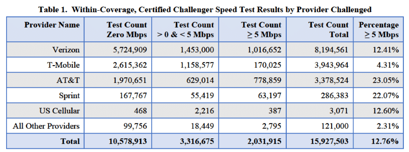
21 challengers submitted 20.8 million speed tests across 37 states.

The challenge data often showed failed tests and lackluster speeds in areas where network operators claimed to offer coverage:5

During the challenge process, some parties entered specific concerns into the record. For example:6

Smith Bagley (d/b/a Cellular One) submitted maps of its service area in Arizona overlaid with Verizon’s publicly-stated 4G LTE coverage and the preliminary results of drive tests that Smith Bagley had conducted. Smith Bagley asserted that, for large stretches of road in areas where Verizon reported coverage, its drive testers recorded no 4G LTE signal on Verizon’s network. Smith Bagley argued that the ‘apparent scope of Verizon’s inaccurate data and overstated coverage claims is so extensive that, as a practical matter, the challenge process will not and cannot produce the necessary corrections.’
As part of a public report detailing its experience, Vermont published a map showing its speed test results which contradicted the coverage maps in Vermont of U.S. Cellular, T-Mobile, and Verizon, among others. This map included information on the approximately 187,000 speed tests submitted by Vermont, including download speed, latency, and signal strength. In the report, Vermont detailed that 96% of speed tests for U.S. Cellular, 77% for T-Mobile, and 55% for Verizon failed to receive download speeds of at least 5 Mbps.

After reviewing the challenges, the FCC requested additional information from the five largest network operators (AT&T, T-Mobile, Verizon, Sprint, and U.S. Cellular) to understand the assumptions involved in the networks’ coverage models.

FCC tests

Around the same time the FCC was requesting additional information from network operators, the agency also began its own testing of Verizon, U.S. Cellular, and T-Mobile’s networks. These speed tests took place in 12 states and primarily made use of a drive-testing methodology. As mentioned earlier, analyses of the FCC’s test data suggested that the on-the-ground experience with Verizon, T-Mobile, and U.S. Cellular’s network was much different than the experience that would be expected based on the information the networks provided to the FCC.

What happened?

A lot of the commentary and news articles I’ve seen in response to the FCC’s report seem to conclude that network operators are bullshitters that intentionally lied about the extent of their coverage. I have reservations about fully accepting that conclusion. Accurately modeling coverage is difficult. Lots of factors affect the on-the-ground experience of wireless subscribers. The FCC largely acknowledges this reality in its report:

Providers were afforded flexibility to use the parameters that they used in their normal course of business when parameters were not specified by the Commission. For example, the Commission did not specify fading statistics or clutter loss values, and providers were required to model these factors as they would in the normal course of business.7
Our speed testing, data analyses, and inquiries, however, suggest that some of these differences may be the result of some providers’ models: (1) using a cell edge RSRP value that was too low, (2) not adequately accounting for network infrastructure constraints, including backhaul type and capacity, or (3) not adequately modeling certain on-the-ground factors—such as the local clutter, terrain, and propagation characteristics by spectrum band for the areas claimed to be covered.8

Further supporting the idea that assessing coverage is difficult, the FCC didn’t just find that its tests contradicted the initial information submitted by network operators. The FCC data also contradicted the data submitted by those who challenged network operators’ data:

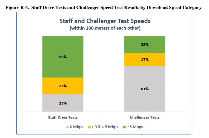
The causes of the large differences in measured download speed between staff and challenger speed tests taken within the same geographic areas, as well as the high percentage of tests with a download speed of zero in the challenger data, are difficult to determine. Discrepancies may be attributable to differences in test methodologies, network factors at the time of test, differences in how speed tet apps or drive test software process data, or other factors…Given the large differences between challenger and staff results however, we are not confident that individual challenger speed test results provide an accurate representation of the typical consumer on-the-ground experience.9

While the FCC found some of the information submitted by networks to be misleading about on-the-ground service quality, I don’t believe it ended up penalizing any network operators or accusing them of anything too serious.10 Still, the FCC did suggest that some of the network operators could have done better:

Staff engineers, however, found that AT&T’s adjustments to its model to meet the MF-II requirements may have resulted in a more realistic projection of where consumers could receive mobile broadband. This suggests that standardization of certain specifications across the largest providers could result in coverage maps with improved accuracy. Similarly, the fact that AT&T was able to submit coverage data that appear to more accurately reflect MF-II coverage requirements raises questions about why other providers did not do so. And while it is true that MF-II challengers submitted speed tests contesting AT&T’s coverage data, unlike for other major providers, no parties alleged in the record that AT&T’s MF-II coverage data were significantly overstated.11

FCC response

The FCC concluded that it should make some changes to its processes:12

First, the Commission should terminate the MF-II Challenge Process. The MF-II coverage maps submitted by several providers are not a sufficiently reliable or accurate basis upon which to complete the challenge process as it was designed.
Second, the Commission should release an Enforcement Advisory on broadband deployment data submissions, including a detailing of the penalties associated with filings that violate federal law, both for the continuing FCC Form 477 filings and the new Digital Opportunity Data Collection. Overstating mobile broadband coverage misleads the public and can misallocate our limited universal service funds.
Third, the Commission should analyze and verify the technical mapping data submitted in the most recent Form 477 filings of Verizon, U.S. Cellular, and T-Mobile to determine whether they meet the Form 477 requirements. Staff recommends that the Commission assemble a team with the requisite expertise and resources to audit the accuracy of mobile broadband coverage maps submitted to the Commission. The Commission should further consider seeking appropriations from Congress to carry out drive testing, as appropriate.
Fourth, the Commission should adopt policies, procedures, and standards in the Digital Opportunity Data Collection rulemaking and elsewhere that allow for submission, verification, and timely publication of mobile broadband coverage data. Mobile broadband coverage data specifications should include, among other parameters, minimum reference signal received power (RSRP) and/or minimum downlink and uplink speeds, standard cell loading factors and cell edge coverage probabilities, maximum terrain and clutter bin sizes, and standard fading statistics. Providers should be required to submit actual on-the-ground evidence of network performance (e.g., speed test measurement samplings, including targeted drive test and stationary test data) that validate the propagation model used to generate the coverage maps. The Commission should consider requiring that providers assume the minimum values for any additional parameters that would be necessary to accurately determine the area where a handset should achieve download and upload speeds no less than the minimum throughput requirement for any modeling that includes such a requirement.

Reflections

The FCC’s report illustrates how hard it is to assess network performance. Assumptions must be made in coverage models, and the assumptions analysts choose to make can have substantial effects on the outputs of their models. Similarly, on-the-ground performance tests don’t always give simple-to-interpret results. Two entities can run tests in the same area and find different results. Factors like the time of day a test was conducted or the type of device that was used in a test can have big consequences.

If we want consumers to have better information about the quality of service networks can offer, we need entities involved in modeling and testing coverage to be transparent about their methodologies.

Tutela’s October 2019 MVNO Report

In October, the network evaluator Tutela released its USA State of MVNOs report. Most network evaluators only assess the performance of the Big Four carriers (AT&T, T-Mobile, Sprint, and Verizon), so it’s interesting to see Tutela assessing a wider range of carriers.

Near the beginning of the report, Tutela shares some reflections on how the MVNO landscape is changing:1

MVNOs and MNO flanker brands in the US carved out a niche largely serving the needs of lower-income customers or those with particular data needs…in 2019, the landscape is rapidly shifting. Technological advancements have made the barrier for operating some kind of network much lower; the entrance of cable companies into the market have pushed MVNO service into the more lucrative postpaid segment; and multi-network MVNOs are innovating on the network side of the equation, rather than solely differentiating on price or customer service.

Methodology

The approach Tutela used to evaluate MVNOs was in line with its usual methodology. The company crowdsourced performance data from typical consumers with the help of code embedded in Tutela’s partners’ apps. In the new report, Tutela primarily considers how well MVNOs performed in regions where at least three of the big four networks offer coverage. Tutela calls these core coverage areas.2

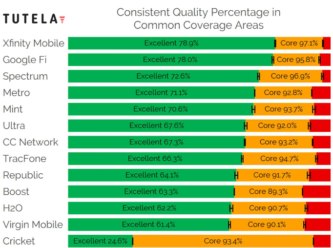
Within core coverage areas, Tutela calculates the amount of time subscribers have service that exceeds two different quality thresholds. When service exceeds the “excellent” threshold, subscribers should be able to do highly demanding things like streaming high-definition video or downloading large files quickly. When service exceeds the “core” threshold, subscribers should be able to carry out typical activities like browsing or streaming music without trouble, but performance issues may be encountered with demanding activities.

Results

Here’s Tutela’s visualization of the main results:3

Tutela results


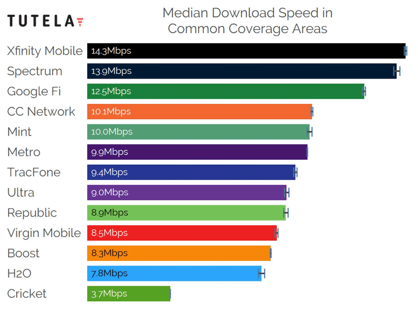
A chart of median download speeds shows a similar ranking among carriers:

Tutela Download Speeds

The results aren’t too surprising. Verizon MVNOs come out near the top of the hierarchy, while Sprint MVNOs tend to come out near the bottom. Cricket Wireless has a good score for the core threshold but does poorly in terms of the excellent threshold. That outcome makes sense since Cricket throttles maximum speeds.

Possible selection bias

I often write about how assessments of network performance that use crowdsourced data may be vulnerable to selection bias. These results from Tutela are no exception. In particular, I wonder if the results are skewed based on how high-quality phones used with different carriers tend to be. In general, newer or more expensive phones have better network hardware than older or cheaper phones.

Xfinity Mobile takes the top spot in the rankings. Xfinity Mobile is a new-ish carrier and is restrictive about which phones are eligible for use with the service. I would guess the average phone used with Xfinity Mobile is a whole lot newer and more valuable than the average phone used with TracFone. Similar arguments could be made for why Spectrum or Google Fi may have an advantage.

To Tutela’s credit, the company acknowledges the possibility of selection bias in at least one case:4

The second factor explaining Google Fi’s performance compared to Metro or Boost is the device breakdown. Although a broad range of Android and iOS devices work with Google Fi’s service, the network is targeted most heavily at owners of Google’s own Pixel devices…The Pixel devices use top-of-the-line cellular modems, which intrinsically provide a better cellular experience than older or mid-range devices.

Wi-Fi results

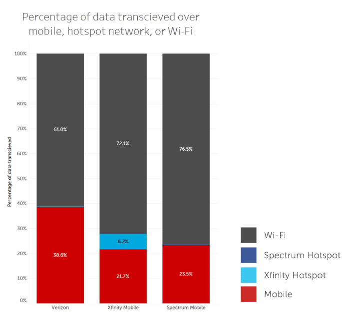
Several MVNOs offer access to Wi-Fi hotspots in addition to cellular networks. I’ve been curious how much data carriers send over Wi-Fi, and Tutela’s results give an estimate. While Xfinity Mobile appears to have sent the largest share of its data via hotspots, it’s a smaller share than I expected:5

Tutela data suggests that Xfinity Mobile has already succeeded in offloading over 6% of smartphone data traffic onto its Wi-Fi network – far more than any other network.

Tutela also shares a graph comparing hotspot usage among different carriers:6

Graph of wi-fi usage share among multiple carriers

Other stuff

There were a few other bits of the report that I found especially interesting. In one section, the report’s authors reflect on the fast growth of MVNOs run by cable companies:7

Xfinity Mobile and Spectrum Mobile captured nearly 50% of the postpaid subscriber growth in Q2 2019, and combined added nearly as many postpaid subscribers as host network Verizon.

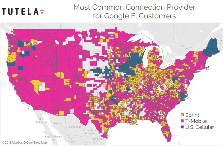
In another part of the report, Tutela shares a map displaying the most common host network that Google Fi subscribers access. It looks like there are a decent number of areas where Sprint or U.S. Cellular provide the primary host network:8

Photo of a frustrated person with a broken phone

Consumer Reports’ Broken Cell Service Rankings

Several months ago, I published a blog post arguing that Consumer Reports’ cell phone rankings were broken. This month, Consumer Reports updated those rankings with data from another round of surveying its subscribers. The rankings are still broken.

Consumer Reports slightly changed its approach this round. While Consumer Reports used to share results on 7 metrics, it now uses 5 metrics:

  1. Value
  2. Customer support
  3. Data
  4. Reception
  5. Telemarketing call frequency

Of the 19 carriers Consumer Reports’ assesses, only 5 operate their own network hardware.1 The other 14 carriers resell access to other companies’ networks while maintaining their own customer support teams and retail presences.2

Several of the carriers that don’t run their own network offer service over only one host network:

  • Cricket Wireless – AT&T’s network
  • Page Plus Cellular – Verizon’s network
  • MetroPCS – T-Mobile’s network
  • CREDO Mobile – Verizon’s network
  • Boost Mobile – Sprint’s network
  • GreatCall – Verizon’s network
  • Virgin Mobile – Sprint’s network

To test the validity of Consumer Reports’ methodology, we can compare scores on metrics assessing network quality between each of these carriers and their host network. At first glance, it looks like the reception and data metrics should both be exclusively about network quality. However, the scores for data account for value as well as quality:3

Data service indicates overall experience (e.g., cost, speed, reliability) with the data service.
I think it was a methodological mistake to account for value within the data metric then account for value again in the value metric. That leaves us with only the reception scores.4 Here are the scores the four host operators get for reception:

  • Verizon – Good
  • T-Mobile – Fair
  • AT&T – Poor
  • Sprint – Poor

How do those companies’ scores compare to scores earned by carriers that piggyback on their networks?

  • Cricket Wireless has good reception while AT&T has poor reception.
  • Page Plus and Verizon both have good reception.
  • MetroPCS has good reception while T-Mobile has fair reception.
  • CREDO and Verizon both have good reception.
  • Boost has very good reception while Sprint has poor reception.
  • GreatCall and Verizon both have good reception.
  • Virgin has good reception while Sprint has poor reception.

In the majority of cases, carriers beat their host networks. The massive differences between Cricket/AT&T and Boost/Sprint are especially concerning. In no cases do host operators beat the carriers that piggyback on their networks. I would have expected the opposite outcome. Host networks generally give higher priority to their direct subscribers when networks are busy.

The rankings are broken.

What’s the problem?

I see two especially plausible explanations for why the survey results aren’t valid for comparison purposes:

  • Non-independent scoring – Respondents may take prices into account when assessing metrics other than value. If that happens, scores won’t be valid for comparisons across carriers.
  • Selection bias – Respondents were not randomly selected to try certain carriers. Accordingly, respondents who use a given carrier probably differ systematically from respondents that use another carrier. Differences in scores between two carriers could reflect either (a) genuine differences in service quality or (b) differences in the type of people who use each service.

Consumer Reports, please do better!

My earlier blog post about Consumer Reports’ methodology is one of the most popular articles I’ve written. I’m nearly certain staff at Consumer Reports have read it. I’ve tried to reach out to Consumer Reports through two different channels. First, I was ignored. Later, I got a response indicating that an editor might reach out to me. So far, that hasn’t happened.

I see three reasonable ways for Consumer Reports’ to respond to the issues I’ve raised:

  • Adjust the survey methodology.
  • Cease ranking cell phone carriers.
  • Continue with the existing methodology, but mention its serious problems prominently when discussing results.

Continuing to publishing rankings based on a broken methodology without disclosing problems is irresponsible.

Abstract photo representing wireless technology

New RootMetrics Report – Verizon Wins Again

Yesterday, RootMetrics released its report on mobile network performance in the first half of 2019. Here are the overall, national scores for each network:1

  • Verizon – 94.8 points
  • AT&T – 93.2 points
  • T-Mobile – 86.9 points
  • Sprint – 86.7 points

While Verizon was the overall winner, AT&T wasn’t too far behind. T-Mobile came in a distant third with Sprint just behind it.

RootMetrics also reports which carriers scored the best on each of its metrics within individual metro areas. Here’s how many metro area awards each carrier won along with the change in the number of rewards received since the last report:2

  • Verizon – 672 awards (+5)
  • AT&T – 380 (+31)
  • T-Mobile – 237 (-86)
  • Sprint – 89 (+9)

My thoughts

Overall this report wasn’t too surprising since the overall results were so similar to those from the previous report. The decline in the number of metro area awards T-Mobile won is large, but I’m not sure I should take the change too seriously. There may have been a big change in T-Mobile’s quality relative to other networks, but I think it’s also possible the change can be explained by noise or a change in methodology. In its report, RootMetrics notes the following:3

T-Mobile’s performance didn’t necessarily get worse. Rather, AT&T, Sprint, and Verizon each made award gains in the test period, which corresponded with T-Mobile’s decreased award count.

I continue to believe RootMetrics’ data collection methodology is far better than Opensignal’s methodology for assessing networks at the national level. I take this latest set of results more seriously than I take the Opensignal results I discussed yesterday. That said, I continue to be worried about a lack of transparency in how RootMetrics aggregates its underlying data to arrive at final results. Doing that aggregation well is hard.

A final note for RootMetrics:
PLEASE DISCLOSE FINANCIAL RELATIONSHIPS WITH COMPANIES YOU EVALUATE!

Network Evaluation Should Be Transparent

Several third-party firms collect data on the performance of U.S. wireless networks. Over the last few months, I’ve tried to dig deeply into several of these firms’ methodologies. In every case, I’ve found the public-facing information to be inadequate. I’ve also been unsuccessful when reaching out to some of the firms for additional information.

It’s my impression that evaluation firms generally make most of their money by selling data access to network operators, analysts, and other entities that are not end consumers. If this was all these companies did with their data, I would understand the lack of transparency. However, most of these companies publish consumer-facing content. Often this takes the form of awards granted to network operators that do well in evaluations. It looks like network operators regularly pay third-party evaluators for permission to advertise the receipt of awards. I wish financial arrangements between evaluators and award winners were a matter of public record, but that’s a topic for another day. Today, I’m focusing on the lack of transparency around evaluation methodologies.

RootMetrics collects data on several different aspects of network performance and aggregates that data to form overall scores for each major network. How exactly does RootMetrics do that aggregation?

The results are converted into scores using a proprietary algorithm.1

I’ve previously written about how difficult it is to combine data on many aspects of a product or service to arrive at a single, overall score. Beyond that, there’s good evidence that different analysts working in good faith with the same raw data often make different analytical choices that lead to substantive differences in the results of their analyses. I’m not going take it on faith that RootMetrics’ proprietary algorithm aggregates data in a highly-defensible manner. No one else should either.

Opensignal had a long history of giving most of its performance awards to T-Mobile.2 Earlier this year, the trend was broken when Verizon took Opensignal’s awards in most categories.3 It’s not clear why Verizon suddenly became a big winner. The abrupt change strikes me as more likely to have been driven by a change in methodology than a genuine change in the performance of networks relative to one another. Since little is published about Opensignal’s methodology, I can’t confirm or disconfirm my speculation. In Opensignal’s case, questions about methodology are not trivial. There’s good reason to be concerned about possible selection bias in Opensignal’s analyses. Opensignal’s Analytics Charter states:4

Our analytics are designed to ensure that each user has an equal impact on the results, and that only real users are counted: ‘one user, one vote’.

Carriers will differ in the proportion of their subscribers that live in rural areas versus densely-populated areas. If the excerpt from the analytics charter is taken literally, it may suggest that Opensignal does not control for differences in subscribers’ geography or demographics. That could explain why T-Mobile has managed to win so many Opensignal awards when T-Mobile obviously does not have the best-performing network at the national level.

Carriers advertise awards from evaluators because third-parties are perceived to be credible. The public deserves to have enough information to assess whether third-party evaluators merit that credibility.

Consumer Reports’ Fundraising Gimmicks

You better cut the pizza in four pieces because I’m not hungry enough to eat six.Yogi Berra (allegedly)

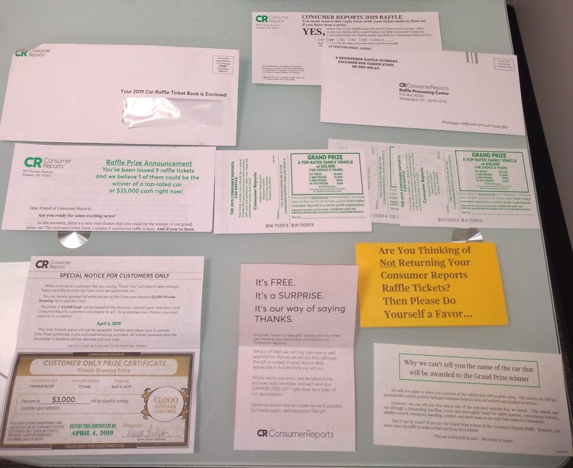
The other day, I received a mailing from Consumer Reports. It was soliciting contributions for a raffle fundraiser. The mailing had nine raffle tickets in it. Consumer Reports was requesting that I send back the tickets with a suggested donation of $9 (one dollar for each ticket). The mailing had a lot of paper:

The raffle had a grand prize that would be the choice of an undisclosed, top-rated car or $35,000. There were a number of smaller prizes bringing the total amount up for grabs to about $50,000.

The materials included a lot of gimmicky text:

  • “If you’ve been issued the top winning raffle number, then 1 of those tickets is definitely the winner or a top-rated car — or $35,000 in cash.”
  • “Why risk throwing away what could be a huge pay day?”
  • “There’s a very real chance you could be the winner of our grand prize car!”

Consumer Reports also indicates that they’ll send a free, surprise gift to anyone who donates $10 or more. It feels funny to donate money hoping that I might win more than I donate, but I get it. Fundraising gimmicks work. That said, I get frustrated when fundraising gimmicks are dishonest.

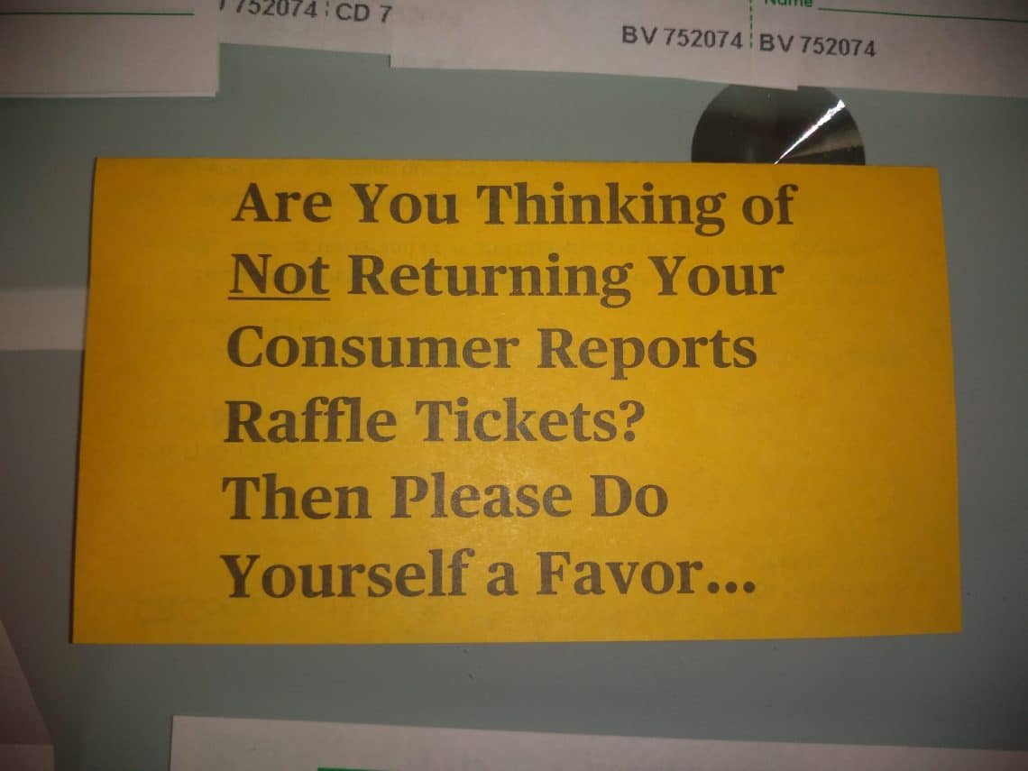
One of the papers in the mailing came folded with print on each side. Here’s the front:

On the other side, I found a letter from someone involved in Consumer Reports’ marketing. The letter argues that it would be silly for me not to find out if I received winning tickets:

It amazes me that among the many people who receive our Consumer Reports Raffle Tickets — containing multiple tickets, mind you, not just one — some choose not to mail them in. And they do this, despite the fact there is no donation required for someone to find out if he or she has won…So when people don’t respond it doesn’t make any sense to me at all.

The multiple tickets bit is silly. It’s like the Yogi Berra line at the opening of the post; cutting a pizza into more slices doesn’t create more food. It doesn’t matter how many tickets I have unless I get more tickets than the typical person.

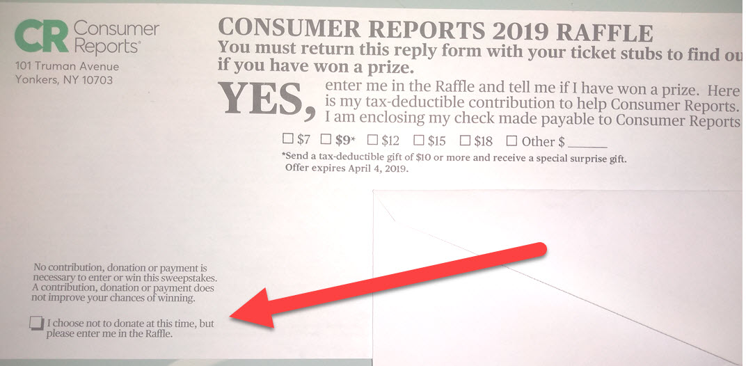
Come on. Consumer Reports doesn’t care if a non-donor decides not to turn in tickets. What’s the most plausible explanation for why Consumer Reports includes the orange letter? People who would otherwise ignore the mailing sometimes end up feeling guilty enough to make a donation. Checking the “I choose not to donate at this time, but please enter me in the Raffle” box on the envelope doesn’t feel great.

Writing my name on each ticket, reading the materials, and mailing the tickets takes time. My odds of winning are low. Stamps cost money.

Let’s give Consumer Reports the benefit of the doubt and pretend that the only reason not to participate is that stamps cost money. The appropriate stamp costs 55 cents at the moment.1 Is the expected reward for sending in the tickets greater than 55 cents?

Consumer Reports has about 6 million subscribers.2 Let’s continue to give Consumer Reports the benefit of the doubt and assume it can print everything, send mailings, handle the logistics of the raffle, and send gifts back to donors for only $0.50 per subscriber. That puts the promotion’s cost at about 3 million dollars. The $50,000 of prizes is trivial in comparison. Let’s further assume that Consumer Reports runs the promotion expecting that additional donations the promotion brings in will cover the promotion’s cost.

The suggested donation is $9. Let’s say the average, additional funding brought in by this campaign comes out to $10 per respondent.3 To break even, Consumer Reports needs to have 300,000 respondents.

With 300,000 respondents, nine tickets each, and $50,000 in prizes, the expected return is about 1.7 cents per ticket.4 Sixteen cents per person.5 Not even close to the cost of a stamp.


4/12/2019 Update: I received a second, almost-identical mailing in early April.

10/3/2019 Update: I received a few more of these mailings.

Thoughts on TopTenReviews

Thumbs down image
I’m not a fan.

TopTenReviews ranks products and services in a huge number of industries. Stock trading platforms, home appliances, audio editing software, and hot tubs are all covered.

TopTenReviews’ parent company, Purch, describes TopTenReviews as a service that offers, “Expert reviews and comparisons.”1

Many of TopTenReviews’ evaluations open with lines like this:

We spent over 60 hours researching dozens of cell phone service providers to find the best ones.2

I’ve seen numbers between 40 and 80 hours in a handful of articles. It takes a hell of a lot more time to understand an industry at an expert level.

I’m unimpressed by TopTenReviews’ rankings in industries I’m knowledgable about. This is especially frustrating since TopTenReviews often ranks well in Google.

A particularly bad example: indoor bike trainers. These devices can turn regular bikes into stationary bikes that can be ridden indoors.

I love biking and used to ride indoor trainers a fair amount. I’m suspicious the editor who came up with the trainer rankings at TopTenReviews couldn’t say the same.

The following paragraph is found under the heading “How we tested on the page for bike trainers”:

We’ve researched and evaluated the best roller, magnetic, fluid, wind and direct-drivebike [sic] trainers for the past two years and found the features that make the best ride for your indoor training. Our reviewers dug into manufacturers’ websites and engineering documents, asked questions of expert riders on cycling forums, and evaluated the pros and cons of features on the various models we chose for our product lineup. From there, we compared and evaluated the top models of each style to reach our conclusions. 3

There’s no mention of using physical products.

The top overall trainer is the Kinetic Road Machine. It’s expensive but probably a good recommendation. I know lots of people with either that model or similar models who really like their trainers.

However, I don’t trust TopTenReviews’ credibility. TopTenReviews has a list of pros and cons for the Kinetic Road Machine. One con is: “Not designed to handle 700c wheels.” It is.

It’s a big error. 700c is an incredibly common wheel size for road bikes. I’d bet the majority of people using trainers have 700c wheels.4 If the trainer wasn’t compatible with 700c wheels, it wouldn’t deserve the “best overall” designation.

TopTenReviews even states, “The trainer’s frame fits 22-inch to 29-inch bike wheels.” 700c wheels fall within that range. A bike expert would know that.

Bike crash

TopTenReviews’ website has concerning statements about its approach and methodology. An excerpt from their about page (emphasis mine):

Our tests gather data on features, ease of use, durability and the level of customer support provided by the manufacturer. Using a proprietary weighted system (i.e., a complicated algorithm), the data is scored and the rankings laid out, and we award the three top-ranked products with our Gold, Silver and Bronze Awards.5

Maybe TopTenReviews came up with an awesome algorithm no one else has thought of. I find it much more plausible that—if a single algorithm exists—the algorithm is private because it’s silly and easy to find flaws in.

TopTenReviews receives compensation from many of the companies it recommends. While this is a serious conflict of interest, it doesn’t mean all of TopTenReviews’ work is bullshit. However, I see this line on the about page as a red flag:

Methods of monetization in no way affect the rankings of the products, services or companies we review. Period.6

Avoiding bias is difficult. Totally eliminating it is almost always unrealistic.

Employees doing evaluations will sometimes have a sense of how lucrative it will be for certain products to receive top recommendations. These employees would probably be correct to bet that they’ll sometimes be indirectly rewarded for creating content that’s good for the company’s bottom line.

Even if the company is being careful, bias can creep up insidiously. Someone has to decide what the company’s priorities will be. Even if reviewers don’t do anything dishonest, the company strategy will probably entail doing evaluations in industries where high-paying affiliate programs are common.

Reviews will need occasional updates. Won’t updates in industries where the updates could shift high-commission products to higher rankings take priority?

TopTenReviews has a page on foam mattresses that can be ordered online. I’ve bought two extremely cheap Zinus mattresses on Amazon.7 I’ve recommended these mattresses to a bunch of people. They’re super popular on Amazon.8 TopTenReviews doesn’t list Zinus.9

Perhaps it’s because other companies offer huge commissions.10 I recommend The War To Sell You A Mattress Is An Internet Nightmare for more about how commissions shadily distort mattress reviews. It’s a phenomenal article.

R-Tools Technology Inc. has a great article discussing their software’s position in TopTenReviews’ rankings, misleading information communicated by TopTenReviews, and conflicts of interest.

The article suggests that TopTenReviews may have declined in quality over the years:

In 2013, changes started to happen. The two principals that had made TopTenReviews a household name moved on to other endeavors at precisely the same time. Jerry Ropelato became CEO of WhiteClouds, a startup in the 3D printing industry. That same year, Stan Bassett moved on to Alliance Health Networks. Then, in 2014, the parent company of TopTenReviews rebranded itself from TechMediaNetwork to Purch.

Purch has quite a different business model than TopTenReviews did when it first started. Purch, which boasted revenues of $100 million in 2014, has been steadily acquiring numerous review sites over the years, including TopTenReviews, Tom’s Guide, Tom’s Hardware, Laptop magazine, HowtoGeek, MobileNations, Anandtech, WonderHowTo and many, many more.11

I don’t think I would have loved the pre-2013 website, but I think I’d have more respect for it than today’s version of TopTenReviews.

I’m not surprised TopTenReviews can’t cover hundreds of product types and consistently provide good information. I wish Google didn’t let it rank so well.

Issues with Consumer Reports’ 2017 Cell Phone Plan Rankings


Consumer Reports offers ratings of cellular service providers based on survey data collected from Consumer Reports subscribers. Through subscriber surveying in 2017, Consumer Reports collected data on seven metrics:1

  1. Value
  2. Data service quality
  3. Voice service quality
  4. Text service quality
  5. Web service quality
  6. Telemarketing call frequency
  7. Support service quality

The surveys collected data from over 100,000 subscribers.2 I believe Consumer Reports would frown upon a granular discussion of the exact survey results, so I’ll remain vague about exact ratings in this post. If you would like to see the full results of their survey, Consumer Reports subscribers can do so here.

Survey results

Results are reported for 20 service providers. Most of these providers are mobile virtual network operators (MVNOs). MVNOs don’t operate their own network hardware but make use of other companies’ networks. For the most part, MVNOs use networks provided by the Big Four (Verizon, Sprint, AT&T, and T-Mobile).

Interestingly, the Big Four do poorly in Consumer Reports’ evaluation. Verizon, AT&T, and Sprint receive the lowest overall ratings and take the last three spots. T-Mobile doesn’t do much better.

This is surprising. The Big Four do terribly, even though MVNOs are using the Big Four’s networks. Generally, I would expect the Big Four to offer network access to their direct subscribers that is as good or better than the access that MVNO subscribers receive.

It’s possible that the good ratings can be explained by MVNOs offering prices and customer service far better than the Big Four—making them deserving of the high ratings for reasons separate from network quality.

Testing the survey’s validity

To test the reliability of Consumer Reports methodology, we can compare MVNOs to the Big Four using only the metrics about network quality (ignoring measures of value, telemarketing call frequency, and support quality). In many cases, MVNOs use more than one of the Big Four’s networks. However, several MVNOs use only one network, allowing for easy apples-to-apples comparisons.3

  • Boost Mobile is owned by Sprint.
  • Virgin Mobile is owned by Sprint.
  • Circket Wireless is owned by AT&T.
  • MetroPCS is owned by T-Mobile.
  • GreatCall runs exclusively on Verizon’s network.
  • Page Plus Cellular runs exclusively on Verizon’s network.

When comparing network quality ratings between these MVNOs and the companies that run their networks:

  • Boost Mobile’s ratings beat Sprint’s ratings in every category.
  • Virgin Mobile’s ratings beat Sprint’s ratings in every category.
  • Cricket Wireless’s ratings beat or tie AT&T’s ratings in every category.
  • MetroPCS’s ratings beat or tie T-Mobile’s ratings in every category.
  • GreatCall doesn’t have a rating for web quality due to insufficient data. GreatCall’s ratings match or beat Verizon in the other categories.
  • Page Plus Cellular doesn’t have a rating for web quality due to insufficient data. Page Plus’ ratings match or beat Verizon in the other categories.
World’s best stock photo.
Taken at face value, these are odd results. There are complicated stories you could tell to salvage the results, but I think it’s much more plausible that Consumer Reports’ surveys just don’t work well for evaluating the relative quality of cell phone service providers.

Why aren’t the results reliable?

I’m not sure why the surveys don’t work, but I see three promising explanations:

  • Metrics may not be evaluated independently. For example, consumers might take a service’s price into account when providing a rating of its voice quality.
  • Lack of objective evaluations. Consumers may not provide objective evaluations. Perhaps consumers are aware of some sort of general stigma about Sprint that unfairly affects how they evaluate Sprint’s quality (but that same stigma may not be applied to MVNOs that use Sprint’s network).
  • Selection bias. Individuals who subscribe to one carrier are probably, on average, different from individuals who subscribe to another carrier. Perhaps individuals who have used Carrier A tend to use small amounts of data and are lenient when rating data service quality. Individuals who have used Carrier B may get more upset about data quality issues. Consumer Cellular took the top spot in the 2017 rankings. I don’t think it’s coincidental that Consumer Cellular has pursued branding and marketing strategies to target senior citizens.4

Consumer Reports’ website gives the impression that their cell phone plan rankings will be reliable for comparison purposes.5 They won’t be.

The ratings do capture whether survey respondents are happy with their services. However, the ratings have serious limitations for shoppers trying to assess whether they’ll be satisfied with a given service.

I suspect Consumer Reports’ ratings for other product categories that rely on similar surveys will also be unreliable. However, the concerns I’m raising only apply to a subset of Consumer Reports’ evaluations. A lot of Consumer Reports’ work is based on product testing rather than consumer surveys.