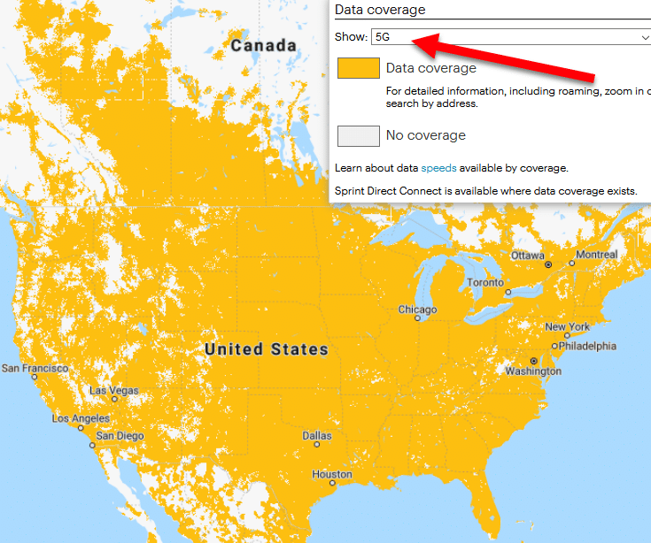
Today I was looking at Sprint’s coverage map. By default, the map appears to be displaying Sprint’s coverage profile for 5G data:

Sprint barely has any 5G coverage, so the map surprised me.
If you change the selection in the dropdown menu, you’ll see that the area shaded for “Data coverage” is identical whether the 4G or the 5G option is selected. However, the shaded area changes when “Non-LTE” is selected on the dropdown. I think Sprint may have made an honest mistake, but it has the potential to confuse consumers.
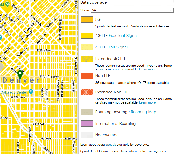
As you scroll in on specific areas, the “Data coverage” entry in the legend disappears and more finely grained categories appear:

It’s odd that users can select specific types of coverage but still see a map that differentiates between multiple types of coverage.
We know AT&T is willing to mislead its customers into believing their 4G service is 5G. At the moment, I’m going to give Sprint the benefit of the doubt. After all, the legend doesn’t even appear until a user toggles its visibility.
