I’ve released a new version of the coverage map with a few updates:
- Restrictions that prevented users from zooming out have been lifted
- Coverage reporting around bodies of water and shorelines has improved
- UI changes were introduced for Alaska and US Territories
- Roads are more visible
The rest of this post is a deep dive into the changes. I’d encourage most readers to skip the post and check out the updated map.
Zoom Freely
Previously, Coverage Critic’s map prevented users from zooming out too far. The zoom restriction is gone now.
With the small hexagons typically used in Coverage Critic’s maps, about 100 million hexagons are needed to cover the US. The map can’t display that many hexagons at once. Rendering breaks when viewing an area much larger than 100 miles across.
The updated map transitions to using larger hexagons when necessary. Roughly 40,000 of these large hexagons are needed to cover the US. Each hexagon is roughly 10 miles across.
Coverage quality is usually heterogeneous within large areas. Portions of a giant hexagon may have great coverage, while other portions of the same hexagon have no coverage. Consequently, the map is colored very simply when users are zoomed out. One color (green by default) is used if at least 50% of a hexagon is covered. If less than half a hexagon is colored, a different color (red by default) is used.
Users assessing coverage will find the most helpful information while zoomed-in and viewing the smallest hexagons available. I’ve designed the map to nudge people accordingly. While zoomed out, users will see an alert encouraging them to zoom in. With the default settings, the color palette changes a bit when large hexagons start rendering. It may not be the most aesthetically appealing design choice, but I hope it gives users an indication that a meaningful transition occurred with the shift to larger hexagons.
I find this approach strikes a good balance with the default map (the one based primarily on FCC data). I’ve not used the same approach for the map that shows crowdsourced coverage data from vehicles. Coverage data won’t render when users of the crowdsourced map zoom out too far. They’ll only see an alert encouraging them to zoom in.1
Better Accounting For Water Hexes
In earlier versions of the map, coverage wasn’t represented consistently around bodies of water and shorelines. I now have a good system for detecting hexes that are fully or partially within bodies of water. However, deciding how to display these hexes within the map is still tricky. Network operators don’t follow the same procedures for determining when and how to exclude bodies of water from their reported coverage areas.
Here’s what the last version of the map looked like when displaying Verizon’s coverage in Miami:
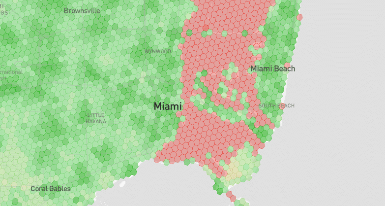
If you happened to be boating within those red hexes, you’d probably have service. Verizon just excluded that area from its reporting. Most of the problematic hexes don’t appear in the new map, but it’s not perfect. Some stray red hexes occasionally appear on shorelines where coverage actually exists. There are also occasional spots where the map looks spotty because a random hex falling on a river isn’t mapped. Some of the imperfections should be resolved in future versions of the map.
For the sake of scoring cities coverage on a 0-10 scale, the water detection system should function awfully well. I can pretty safely ignore all potential water hexes where networks might be inconsistent in coverage reporting.
Alaska & US Territories UI Changes
With the previous map update, I quietly added data showing coverage in Alaska and US Territories. The map only shows networks’ native coverage, so it may not be useful for users on plans that rely on roaming coverage in these areas. If map users view these areas, they’ll see an alert that cautions them appropriately.
More Visible Roads
I’ve made roads more visible on the map, especially for users that are zoomed-in on small regions. I expect I’ll continue to tweak roads’ display properties over time.
A Work In Progress
As always, I’d love feedback. I want to thank Reddit’s NoContract community for the thoughts they’ve shared so far. Shout out to user Starfox-sf, who had great ideas for this latest update.