I just released a minor update to the coverage map.
- Sharable map links are now available
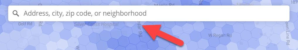
- Users can now enter locations using coordinates (format as signed decimal degrees; e.g., 38.897700, -77.036500)
The new share options appear in two places. From the main user interface, you can click the share icon to get a link that captures features of your current view (e.g., the map’s center, the color scheme, the selected network and technology). There’s also a share button visible after selecting a specific hex. Links generated with that button direct to a map centered on the selected hex with a pin marking the location.
I’d like to offer my thanks to Reddit user redi20 for the suggestion to add support for coordinates.
Much larger map updates will be coming shortly!