Plants growing in pots

T-Mobile Adds Data To Connect Plans

T-Mobile just increased the data allotments on its original Connect plans.

  • $15 Plan – Increased from 3.5GB per month to 5GB
  • $25 Plan – Increased from 6.5GB per month to 8GB

These plans were originally introduced to appease regulators during the merger between T-Mobile and Sprint. While T-Mobile committed to increasing data allotments on the plans by 500MB per year, the latest changes exceed T-Mobile’s obligation by 3x.

Underrated Plans

For years, I’ve considered T-Mobile’s Connect plans among the best budget-friendly, limited-data offerings. While the plans aren’t the absolute cheapest options on the market, many consumers are more comfortable purchasing from a big, well-known brand like T-Mobile.1

T-Mobile doesn’t market the plans heavily because they’re not terribly profitable. Reviewers rarely mention the Connect plans since T-Mobile doesn’t compensate people for referring subscribers.

Looking Forward

I’m not aware of T-Mobile making commitments to regulators about the state of the Connect plans after 2025. I’m unsure if T-Mobile will continue to gradually improve the Connect plans, let the offerings stagnate, or actively force customers to migrate to other plans. The two newer Connect plans (a $10/1GB plan & a $35/12GB plan) were not part of commitments to regulators. Those plans were unchanged in the recent updates.


Hat tip to Stetson Doggett, who alerted me to the plan updates.

Two arrows merging into one

US Mobile Announces Multi-Network Plans

Earlier this week, US Mobile announced a closed beta for a new, multi-network offering. Here’s the core excerpt from the announcement that Ahmed Khattak, US Mobile’s CEO, shared on Reddit:

Over the past couple of months, I’ve been thoroughly testing the cellular switching functionality on my phone and have been genuinely impressed. Conducting granular speed tests in areas where I know network performance varies sparked an exciting idea: how do we bring this capability to our customers? In that spirit, I am thrilled to announce the launch of our Multi-Network Unlimited Plans, starting with a closed beta.

With these plans, you can use your unlimited data across multiple networks on a single device that supports DSDS (eSIM/eSIM or eSIM/pSIM). For an additional cost of $15, you can add a line from another network to your device and share your unlimited data seamlessly between both networks.

OS-Level Switching

As far as I can tell, US Mobile plans to rely on the cellular data switching capacities that are available on multi-SIM devices and built into Android and iOS. The approach differs from what we saw with Google Fi’s (now largely abandoned) switching technology that functioned with a single SIM card.

My impression, shared by many Reddit commenters, is that OS-level automated switching between SIM cards is not seamless or optimal. Network switching occurs reliably when an active network becomes unavailable. Switching may occur at other times as well, but the technology falls short of constantly testing both networks and reliably selecting the better network at every moment.

So far, I sound negative. But I’m thrilled about this announcement. While I don’t understand the underlying technology, I expect both Google and Apple will try to improve this technology as more people run muti-SIM setups. I’m glad US Mobile can piggyback on these behemoth companies instead of trying to do tough technical work themselves.

And US Mobile is still pulling off a possibly first-of-its-kind feat in logistics. While users have SIMs on two different networks, US Mobile’s systems can treat this service similarly to to a single plan that draws on one unified pool of data.

Getting Technical

In response to questions from Reddit users, Khattak edited the announcement to add technical details covering how the network switching works:

To optimize the performance of a device employing Dual SIM Dual Standby (DSDS) technology in network selection, the device employs a methodology based on assessing the viability of switching between primary and secondary networks. This assessment begins with the calculation of an estimated link capacity for both the primary and secondary networks. This estimation leverages the instantaneous link capacity data obtained through the device’s radio transceiver.

Subsequently, the estimated link capacity for each network is paired with the device’s data usage, resulting in a congestion ratio representing the ratio of data usage to link capacity for each network. Higher congestion ratio values signify elevated data usage on the respective network and/or comparatively lower link capacity. This indicates a higher likelihood of encountering slower data transfer speeds and diminished performance when utilizing that particular network.

The process of estimating link capacity and device data usage operates over a defined time window, adjustable to accommodate desired sensitivity levels in the estimates. Additionally, a moving average of the congestion ratio is continuously computed for each network, serving as an ongoing reference maintained by the device. This ensures a dynamic assessment of network performance, facilitating informed decisions regarding network switching to optimize the device’s connectivity experience.

I read over that several times, but I may not fully comprehend it. Three metrics are mentioned: (1) data usage, (2) link capacity, and (3) congestion ratio. Link capacity will differ between two networks. While data usage changes over time, I believe it should be the same for both networks at any given moment. Since the congestion ratio is just the ratio of the other two metrics, I think only link capacity matters at the end of the day.

Perhaps more importantly, the explanation seems to describe how switching technology could work in an idealized scenario. I’m not sure how relevant it is to how switching occurs today in the real world. US Mobile appears cognizant of that. In comments on the announcement, Khattak suggests latency may play a role in switching decisions. If latency is accounted for, that may occur outside of the process described in the excerpt above.

Network Switching Is Complicated

My hunch is that US Mobile doesn’t fully understand how OS-level switching decisions are made. And I don’t mean that as a dig. I consider network switching one of the most interesting technologies emerging in cellular, and I don’t understand how it works. The underlying mechanisms could even be changing as Google and Apple update their operating systems.

Anyhow, it’s great to see a new multi-network option hitting the market—particularly one that comes without an outrageous price point.

US Mobile Launches $15 Per Month 10GB Plan

US Mobile launched a new phone plan that offers unlimited minutes and texts along with 10GB of data per month. The plan is only available with annual billing for $180 per year (equivalent to $15 per month).

Plan Details

Subscribers on the new plan can opt for either Verizon or T-Mobile’s network. In US Mobile’s parlance, the Verizon-based service is called Warp 5G, and the T-Mobile-based service is called GSM. Most subscribers will default to Verizon’s network. Unlike many low-cost plans, US Mobile’s offering has premium data. Subscribers won’t end up in the back of the priority queue when the network is congested.

Data is hard-capped, meaning that subscribers’ data service is cut off entirely after 10GB of use. Data top-ups are available for purchase, but the pricing isn’t as good as the initial $1.50 per GB rate on the first 10GB.

The annual-only nature of US Mobile’s plan may be unappealing to some prospective subscribers. For those who want to test drive the service and plan to port in an existing number, it may be best to start with US Mobile’s 30-day free trial before opting for the new plan.

Competing With Mint

I expect US Mobile is trying to position itself competitively with Mint Mobile. Mint typically reserves its best rates for customers who purchase 12 months of service upfront. Mint’s comparable $180 per year plan includes only 5GB of data.

Things To Come

In a Reddit post about the new plans, US Mobile’s CEO suggested an AT&T-based plan is coming to US Mobile in June. He also indicated that a feature allowing subscribers to set custom max speeds is coming later this year.

Photo of an open padlock

T-Mobile’s Price Unlock

Here’s how T-Mobile used to describe its old Price Lock guarantee (thank you, Archive.org):

Price Lock is our guarantee that we won’t raise the price of your qualifying rate plan for new accounts. You can rest assured that T-Mobile won’t raise the price of your regular monthly rate plan price…as long as you’re a T-Mobile customer and keep your plan.

As of today, new subscribers can receive something that’s still called Price Lock, but the terms are different:

Starting January 18, 2024, customers activating or switching to an eligible rate plan get our Price Lock guarantee that only you can change what you pay—and we mean it! To show just how serious we are, if we were to make a price change and you decide to leave, just let us know within 60 days and we’ll cover the cost of your final month’s recurring service charges.

The old Price Lock was purportedly a passive guarantee. Subscribers allegedly didn’t need to do anything to keep the rates they started with.1

The new Price Lock (1) doesn’t lock in prices, and (2) requires active involvement from anyone taking advantage of it. Most people don’t memorize or monitor the detailed terms of their phone plans. If T-Mobile raises prices on plans covered by the new Price Lock policy, I doubt many customers will remember they’re eligible for a bill credit if they leave.

The new policy is fine. But it needs a name change.

Coverage map of San Francisco

Coverage Map Update – Water & Zooming

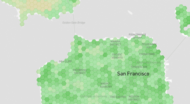
I’ve released a new version of the coverage map with a few updates:

  • Restrictions that prevented users from zooming out have been lifted
  • Coverage reporting around bodies of water and shorelines has improved
  • UI changes were introduced for Alaska and US Territories
  • Roads are more visible

The rest of this post is a deep dive into the changes. I’d encourage most readers to skip the post and check out the updated map.

Zoom Freely

Previously, Coverage Critic’s map prevented users from zooming out too far. The zoom restriction is gone now.

With the small hexagons typically used in Coverage Critic’s maps, about 100 million hexagons are needed to cover the US. The map can’t display that many hexagons at once. Rendering breaks when viewing an area much larger than 100 miles across.

The updated map transitions to using larger hexagons when necessary. Roughly 40,000 of these large hexagons are needed to cover the US. Each hexagon is roughly 10 miles across.

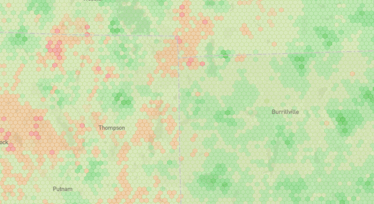
Coverage quality is usually heterogeneous within large areas. Portions of a giant hexagon may have great coverage, while other portions of the same hexagon have no coverage. Consequently, the map is colored very simply when users are zoomed out. One color (green by default) is used if at least 50% of a hexagon is covered. If less than half a hexagon is colored, a different color (red by default) is used.

Users assessing coverage will find the most helpful information while zoomed-in and viewing the smallest hexagons available. I’ve designed the map to nudge people accordingly. While zoomed out, users will see an alert encouraging them to zoom in. With the default settings, the color palette changes a bit when large hexagons start rendering. It may not be the most aesthetically appealing design choice, but I hope it gives users an indication that a meaningful transition occurred with the shift to larger hexagons.

I find this approach strikes a good balance with the default map (the one based primarily on FCC data). I’ve not used the same approach for the map that shows crowdsourced coverage data from vehicles. Coverage data won’t render when users of the crowdsourced map zoom out too far. They’ll only see an alert encouraging them to zoom in.1

Better Accounting For Water Hexes

In earlier versions of the map, coverage wasn’t represented consistently around bodies of water and shorelines. I now have a good system for detecting hexes that are fully or partially within bodies of water. However, deciding how to display these hexes within the map is still tricky. Network operators don’t follow the same procedures for determining when and how to exclude bodies of water from their reported coverage areas.

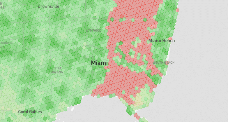
Here’s what the last version of the map looked like when displaying Verizon’s coverage in Miami:

Coverage map screenshot in Miami showing red hexes in a body of water

If you happened to be boating within those red hexes, you’d probably have service. Verizon just excluded that area from its reporting. Most of the problematic hexes don’t appear in the new map, but it’s not perfect. Some stray red hexes occasionally appear on shorelines where coverage actually exists. There are also occasional spots where the map looks spotty because a random hex falling on a river isn’t mapped. Some of the imperfections should be resolved in future versions of the map.

For the sake of scoring cities coverage on a 0-10 scale, the water detection system should function awfully well. I can pretty safely ignore all potential water hexes where networks might be inconsistent in coverage reporting.

Alaska & US Territories UI Changes

With the previous map update, I quietly added data showing coverage in Alaska and US Territories. The map only shows networks’ native coverage, so it may not be useful for users on plans that rely on roaming coverage in these areas. If map users view these areas, they’ll see an alert that cautions them appropriately.

More Visible Roads

I’ve made roads more visible on the map, especially for users that are zoomed-in on small regions. I expect I’ll continue to tweak roads’ display properties over time.

A Work In Progress

As always, I’d love feedback. I want to thank Reddit’s NoContract community for the thoughts they’ve shared so far. Shout out to user Starfox-sf, who had great ideas for this latest update.

People holding cell phones

Visible’s January Promo

Verizon’s flanker brand, Visible, is running a pretty sweet promo through the end of the month.

Visible’s standard unlimited plan is discounted from $25 per month to $20. The premium Visible+ plan is discounted from $45 to $35.

A Two-Year Deal

Even without this month’s discounts, Visible offers some of the best value in the industry. But what I find most notable about the promo is the explicit duration of the discount (emphasis mine):

New members qualify to receive either (1) $5/mo off the normal rate of the Visible plan or (2) $10/mo off the normal rate of the Visible+ plan for each of the first 24 months of service…Now-current standard costs of service of $25/mo (Visible Plan) or $45/mo (Visible+ Plan) apply starting with the twenty-fifth month.

Carriers often entice people with long-term discounts that are neither guaranteed forever nor given an explicit end date. I get that carriers don’t know what the competitive landscape will look like years down the road, but leaving customers in the dark about how long they’ll receive a discount rubs me the wrong way.

Years ago, T-Mobile tried to buck the trend with a guarantee not to raise prices on certain plans. However, grandfathering customers forever isn’t great for business. In October, T-Mobile flirted with weaseling out of it’s commitment by automatically migrating customers away from grandfathered plans. After some bad press, the company backed down.

I like what Visible is doing. Twenty-four months is a long time. But it’s not such a long time that Visible is likely to look for loopholes to push customers away from the discounts. Perhaps I’m over-optimistic, though. I’ll note another line from the promo’s terms:

For purposes of clarity, any service plan change of any kind – whether initiated by the member or if required by Visible, including but not limited to changes from the Visible plan to the Visible+ plan and vice versa – will result in the discount being removed.
Screenshot showing the updated coverage map

Major Coverage Map Update

Today, I released a significant update to the coverage map.

Update 1: New Data For All Networks

The updated map incorporates the most recent round of data from the FCC’s Broadband Data Collection program. The new data came out last month and represents networks’ coverage as of mid-2023.

The recency of data improved by about six months for all networks. The difference between map versions is especially apparent with Dish’s network. Earlier this year, the company abruptly activated a large portion of its network to meet an FCC obligation. Since that activation occurred in June, it wasn’t captured in the previous version of the map.

I’ve also updated the map of crowdsourced coverage. Compared with the last version, more than double the amount of data underlies the latest crowdsourced map.

Update 2: Calibration Model – Powered By DIMO

The FCC’s metric for signal strength assesses something different from the on-the-ground signal strength consumers are expected to experience. Additionally, there’s a risk of network operators incorrectly reporting coverage. To compensate, the data underlying Coverage Critic’s map now runs through a calibration model.

The calibration model is powered by a trove of DIMO data assessing cell coverage throughout the US. After feeding in a specific network, signal information from the FCC, and a bit of location-specific information, the model predicts actual signal strength.1

The calibration model may be Coverage Critic’s most significant innovation since the map launched. And it will improve with time. Future map versions may incorporate more data, hyper-local adjustments, and additional factors predictive of signal quality.

Update 3: Improved Infrastructure

I rebuilt much of the infrastructure underlying the map. Releasing new versions of the map should be easier now. I’ve also laid the groundwork for better content and improved network-scoring systems on other parts of Coverage Critic. A few changes have effects that are already apparent. E.g., coverage information now displays correctly along state borders.

USA Map Abstract Showing Concept Of Network Connections

Helium Mobile Goes Nationwide

In August, Helium Mobile launched a $5 per month unlimited plan that was exclusively available in the Miami area. At the time, I wrote:

It’s arguably the cheapest unlimited plan on the US market. But the price is kind of contrived.

Peter Adderton, founder of Boost Mobile and current CEO of MobileX, offered a valid correction:

Nationwide Service – $20 Per Month

Today, Helium Mobile launched expanded service. While $5 per month pricing continues for those in the Miami area, people throughout the US can now get service for $20 per month plus taxes.

It’s a pretty sweet deal for what’s essentially T-Mobile service. I’m not confident it’s the cheapest unlimited plan in the US, but it’s a strong contender. In all but the most tax-intensive locations, I think Helium Mobile comes out cheaper than unlimited plans from US Mobile and Visible that start at $25 with taxes baked in.1

2 Points People Miss

I’ve been disappointed by the press coverage of Helium Mobile (both positive and negative). Journalists are missing two key points:

  1. The Helium project has an ambitious goal of building out a network that could allow Helium Mobile to achieve cost savings over conventional MVNOs. Meaningful cost savings have not been achieved yet.
  2. Today, Helium Mobile’s low prices are enabled by what’s effectively a subsidy from investors.

While a $20 plan may not be as unprofitable as a $5 plan, a small MVNO will still take significant losses on a mass-market plan at that price point. That said, it’s pretty normal for new carriers to offer plans that aren’t profitable in hopes of one day reaching economies of scale or achieving new kinds of cost-efficiency.

How Much Does The Average American Pay For Cell Service?

In a Tweet, Helium Mobile compared its $20 per month rate to a $157 per month figure from JD Power. The latter figure allegedly represents what the average American spends on their phone plan.

In a press release, Helium Mobile doubles down on the comparison and describes its new offering as such:

Unlimited data, text and talk that is almost 8X more affordable than the average U.S. cell bill

$157 is the wrong number for the comparison Helium Mobile is making. It’s way too high.

JD Power charges for access to the study, so I’ll only speculate. I’d guess JD Power is looking at the average expenditure of entire households. Most households have multiple people and multiple phone lines. Perhaps the costs of device subsidies or device financing are also sneaking into JD Power’s numbers.

I don’t think prospective customers are being harmed. People care about (1) what they pay for their current carrier and (2) how much less they might pay for Helium Mobile. The average American is irrelevant. Perhaps the comparison could confuse investors, but I doubt many are getting fooled. More than anything else, pushing the $157 statistic makes Helium Mobile look silly.

Screenshot of a coverage map showing a green/red color scheme.

Updated Map Color Schemes

A major update to the coverage map is coming shortly, but I wanted to release a small, interim update first.

With the update released today, the map now defaults to a green-red color scheme for all networks. While the brand-specific colors used previously were kind of fun, I don’t think the meaning of different shades was intuitive. Further, the branded color scheme didn’t work well for making comparisons between multiple networks.

Two new color schemes (blue-yellow and grayscale) have also been added. These color schemes may offer better accessibility for colorblind individuals. Map users can switch to the new color schemes and the old branded color schemes from the map’s settings menu.

Feedback on the changes is welcome. I’ll likely tweak the color schemes when the major map update comes out later this year.

Abstract icon representing the idea of a refresh or an update

FCC Releases Broadband Map V3

Today, the FCC announced the release of the third version of the National Broadband Map. The map shows the availability of internet service providers and cellular coverage throughout the US.

Improved Reliability

The FCC suggested the map is becoming more reliable with successive versions:

Challenges, verifications and audits are all making the Map better. Robust participation in the challenge processes continues to play a valuable role in correcting data shown on the Map. To be specific, the results of 4.8 million challenges to provider reported availability information and over 1.5 million accepted location challenges. Since our last release, we’ve initiated mobile coverage audits in a number of states. We’ve also seen hundreds of corrections to provider reported data based on FCC-initiated verification efforts.

Newer Data

With the recent release, a new round of data is available from the FCC’s Broadband Data Collection program. The previous round of data represented networks’ mobile coverage circa December 2022. The new data reflects networks’ status as of June 2023.

In the coming weeks, I’ll share a new version of Coverage Critic’s maps incorporating the latest data and a handful of other upgrades.