Today, I released a significant update to the coverage map.
Update 1: New Data For All Networks
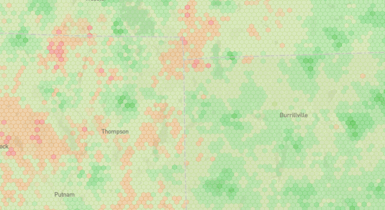
The updated map incorporates the most recent round of data from the FCC’s Broadband Data Collection program. The new data came out last month and represents networks’ coverage as of mid-2023.
The recency of data improved by about six months for all networks. The difference between map versions is especially apparent with Dish’s network. Earlier this year, the company abruptly activated a large portion of its network to meet an FCC obligation. Since that activation occurred in June, it wasn’t captured in the previous version of the map.
I’ve also updated the map of crowdsourced coverage. Compared with the last version, more than double the amount of data underlies the latest crowdsourced map.
Update 2: Calibration Model – Powered By DIMO
The FCC’s metric for signal strength assesses something different from the on-the-ground signal strength consumers are expected to experience. Additionally, there’s a risk of network operators incorrectly reporting coverage. To compensate, the data underlying Coverage Critic’s map now runs through a calibration model.
The calibration model is powered by a trove of DIMO data assessing cell coverage throughout the US. After feeding in a specific network, signal information from the FCC, and a bit of location-specific information, the model predicts actual signal strength.1
The calibration model may be Coverage Critic’s most significant innovation since the map launched. And it will improve with time. Future map versions may incorporate more data, hyper-local adjustments, and additional factors predictive of signal quality.
Update 3: Improved Infrastructure
I rebuilt much of the infrastructure underlying the map. Releasing new versions of the map should be easier now. I’ve also laid the groundwork for better content and improved network-scoring systems on other parts of Coverage Critic. A few changes have effects that are already apparent. E.g., coverage information now displays correctly along state borders.
Footnotes
- The calibration model draws on data about AT&T, T-Mobile, and Verizon’s LTE signal strength. It’s assumed that 5G coverage follows similar patterns. Additionally, US Cellular and Dish are assumed to look roughly similar to the three biggest networks. I haven’t run tests to validate those assumptions, but I plan to.
Also, the map shows signal strengths for outdoor/in-vehicle environments. Signal strength can be much different indoors.
In a previous post, I discussed Coverage Critic’s crowdsourcing of DIMO data in more detail.