
Updated Map Color Schemes
A major update to the coverage map is coming shortly, but I wanted to release a small, interim update first.
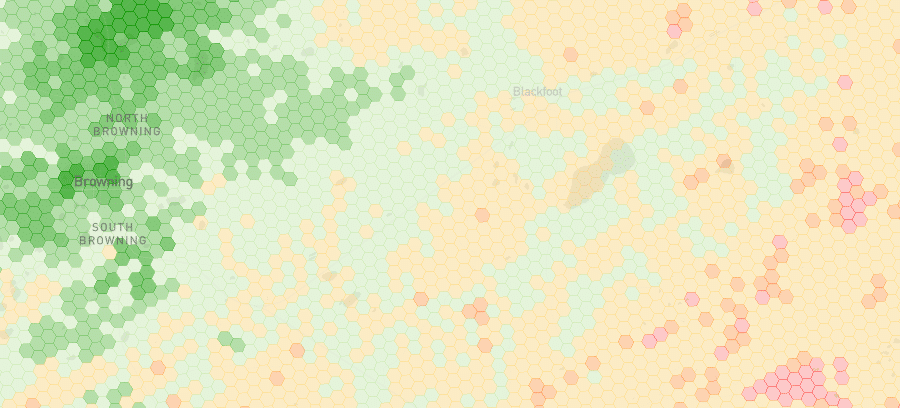
With the update released today, the map now defaults to a green-red color scheme for all networks. While the brand-specific colors used previously were kind of fun, I don’t think the meaning of different shades was intuitive. Further, the branded color scheme didn’t work well for making comparisons between multiple networks.
Two new color schemes (blue-yellow and grayscale) have also been added. These color schemes may offer better accessibility for colorblind individuals. Map users can switch to the new color schemes and the old branded color schemes from the map’s settings menu.
Feedback on the changes is welcome. I’ll likely tweak the color schemes when the major map update comes out later this year.